In response to my last piece for The American Conservative, “Less Sweet, Less Fitting”—which concerned traditional concepts of architectural appropriateness, or what the ancients called decor, and their negation by modernist design—a reader who identifies himself as Chris weighed in as follows:
Weird to see the Twin Tower memorials get dissed…pretty highly regarded both by the layperson and the architectural community. Not reading an explicit critique of them here either… Scale-less architecture has always existed by the way. Just look at the Egyptian pyramids.
As criticism of modern architecture goes, this is a slim pamphlet more than a robust thesis. Some clear cherry picking of examples. What about the TWA terminal or the Guggenheim, both in New York City? What about Louis Kahn?
Of course, Chris is doing some cherry-picking of his own. And a journalistic critique is bound to resemble a pamphlet broadside more than a scholarly thesis. But he deserves a reply even so.
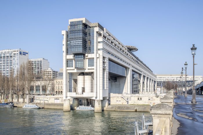
My commentary mainly concerned the failure of the grands travaux undertaken by the late French Socialist president François Mitterand late in the last century. These major civic works—including the Arche de la Défense, the National Library, and the Opéra Bastille—are widely or universally regarded as lemons. So, I might have added, is the hideous neo-Brutalist pile (1988) built alongside, and actually protruding into, the Seine that Mitterand commissioned for the Ministry of Economy and Finance. Its gaping maw looms over a riverfront embankment. I’ll have a bit more to add on the Mitterand travaux shortly.
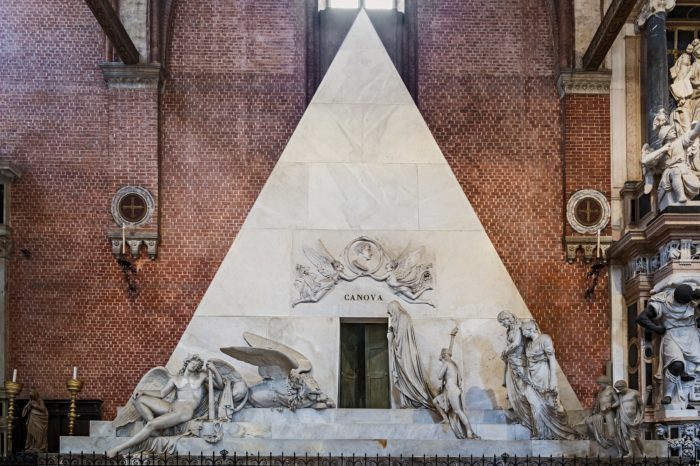
Turning to the scale-less Egyptian pyramids, their influence on Western architecture has been very limited, and for good reason. The Washington Monument is a scale-less, unornamented obelisk, it is true, but it is an architectural outlier. As a Platonic solid, the pyramid better serves to provide an abstract conceptual envelope for an architectural composition, or a sculptural composition for that matter, rather than defining the actual physiognomy of a building. The Parthenon is a pyramidal composition in the sense that lines extending upward from its very slightly inward-tilted columns would intersect a mile or so up in the air. The sculptor Antonio Canova’s pupils used the pyramid’s funereal associations for a monument to their master (1827) at the Basilica dei Frari in Venice, but there the pyramid motif was totally humanized by the various mourning allegorical figures as well as the relief over the entrance including angels and Canova’s portrait.

That is why I.M. Pei could resort to an unornamented glass-and-metal pyramid for his main entrance pavilion to the Louvre (1988). Such a pyramid was “new.” Compared to the Louvre’s highly articulated and refined historic architecture, the Pei pyramid is reductionist bubble gum, but it is understandable that it is more popular than the other Mitterand travaux. It is not hideous. The main point to be made here, however, is that when the leader of a nation with an extraordinarily rich cultural heritage like France undertakes an architectural campaign intended to bear comparison with the achievements of the Bourbon monarchy and nearly all of the resulting buildings backfire, there is a big problem—one whose elucidation is hardly a matter of cherry-picking. The problem, of course, is modernist architecture’s unacceptably high rate of esthetic failure, which largely results from a dysfunctional design mentality.
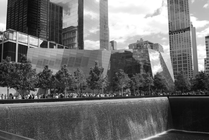
Backing up to the 9/11 memorial at Ground Zero (2011), I have written at length about the memorial, and I think the admiring “layperson” and “the architectural community” Chris cites are abjectly mistaken. The memorial’s symbolic impoverishment is readily telegraphed by its reliance on the Twin Tower cavities as objet trouvés that relieve the designer of the need to conceive something that evokes not just “loss,” which we get from the titanic sheets of water falling into the cavity bottoms and then just literally going down their respective drains, but a nation’s resilience and determination to stand for its abiding ideals. A well-designed memorial could have incorporated the names of 9/11’s victims, as the bronze panels around the cavities’ rims do, but the main consideration in the memorial’s creation should have been the symbolic transcendence of loss, which is distinctly absent. The giveaway is the inclusion of a vast multimedia museum (2014) that serves as a crutch to prop up a symbolically anemic memorial—anemic, yes, in spite of its magnitude. (The Twin Tower cavities each occupy an acre.) And what about the pavilion through which one enters the vast, cavernous underground museum? This deconstructionist heap of dark glass, suggesting collapse rather than endurance, might as well have been designed by Mohamed Atta, the onetime architecture student who flew American Airlines Flight 11 into one of the towers.

Eero Saarinen’s concrete TWA terminal building (1962) at JFK Airport, now the centerpiece of a hotel, is a very different story. Though it ceased functioning as a terminal in 2001, it is an American landmark. Its exterior physiognomy is that of a bird with its outspread wings serving as a roof. A gutter spout is lodged in the creature’s little beak. The building is thus sculpturesque rather than architectural, and it was designed to play off of its dull architectural surroundings. You could not design an entire airport with bird terminals. It would look silly. Saarinen’s interior design was arguably more substantive. Its grand stair, balconies, ceiling and other architectural elements curve, swoop and swerve with a studied emphasis on continuity of mass and line. The sinuously bifurcating stairway suggests that Saarinen aspired to create a space-age place to see and be seen in emulation of the stupendous grand staircase at the Beaux-Arts Opéra Garnier (1875) in Paris.
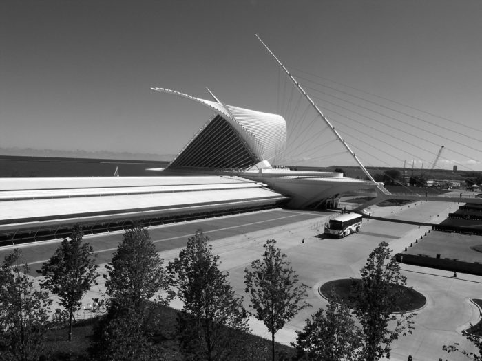
Saarinen recognized modernism’s need to provide something akin to the aesthetic thrill imparted by countless architectural works within the grand tradition in humanist architecture. Yet his terminal interior did not generate a sustained trend in modernist design, or at least a trend that yielded a significant number of results of comparable quality. The birdlike exterior, on the other hand, has a progeny of sorts in Santiago Calatrava’s absurdly overengineered pavilion (2001) at the Milwaukee Art Museum, with its hyper-picturesque, movable wing-shaped brise-soleil, or sunscreen, perched above the building’s central concourse. Ironically, the building resembles not a museum so much as a high-tech airport terminal erected by an upwardly-mobile, second- or third-tier Chinese city looking to make an “iconic” splash. Calatrava also designed the $4 billion transit-center-cum-shopping-mall (2016) at the World Trade Center. Originally conceived as a bird of peace, this outrageously expensive, pointlessly spiky structure looks like it might have been modeled on a dinosaur skeleton instead.
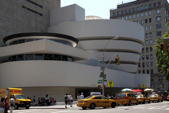
Chris cites New York City’s Guggenheim Museum (1959) as a signal modernist achievement, but in fact the self-indulgent expressionism of Frank Lloyd Wright’s culminating work has served as a harbinger of bad things to come. It also stands in stark contrast to the bulk of Wright’s own oeuvre, which retained a fundamentally architectural character while embracing a wide range of formal experimentation. The Guggenheim is an utterly idiosyncratic concoction made of steel-reinforced concrete. Its dominant volume is an eccentric dome turned upside down, with deeply incised ribbon windows. The museum’s principal gallery is housed within that volume. There the visitor is subjected to the tiresome routine of viewing exhibitions along the spiraling ramp that the architect wrapped around the gallery’s perimeter. The visitor thus gazes at artifacts on display from an incline. So instead of having architectural form follow function, in accordance with that hoary modernist conceit, Wright forced the gallery’s function to bow down before the bizarre form that seized his imagination.

The abstractly sculpturesque Guggenheim represents an architectural kick in the teeth to the very idea of urbanity. It is redolent of the hatred Wright expressed late in life for the “hopelessly inorganic” city, the historic city staggering under the weight of “accumulated rubbish heaps of centuries of false adoration.” Such “false adoration” is epitomized by Richard Morris Hunt’s magisterial Metropolitan Museum entrance pavilion (1904), located a short walk down Fifth Avenue from the Guggenheim. That classical pavilion stems from a tradition that has enriched the human habitat immeasurably. The Guggenheim, by contrast, simply represents a case study in romantic egomania.
Finally, Chris cites Louis Kahn. I’m not sure many readers have even heard of Kahn, who died in 1974. Kahn was himself a modernist romantic, but of a very different stripe from Wright. Classically trained, he was preoccupied with expressing the dignity of human institutions. “I teach appropriateness,” Kahn once proclaimed. “I don’t teach anything else.” Decor, in other words, was of fundamental importance to him. But he thought he detected architecture’s irreducible essence in the ruins of ancient buildings. This eminently romantic fascination reinforced his modernist inclination to abandon architecture’s humanistic qualities. He eschewed all traditional forms of surface enrichment and was preoccupied with the imposition of an abstract, quasi-Platonic geometric order in plan and elevation. His compositions tend to rely on the reiteration of motifs—the multitude of barrel vaults at his Kimbell Art Museum (1972) in Fort Worth, for example—and lack the formal resolution that can come with inclusion of a strong vertical element serving to unify a design.
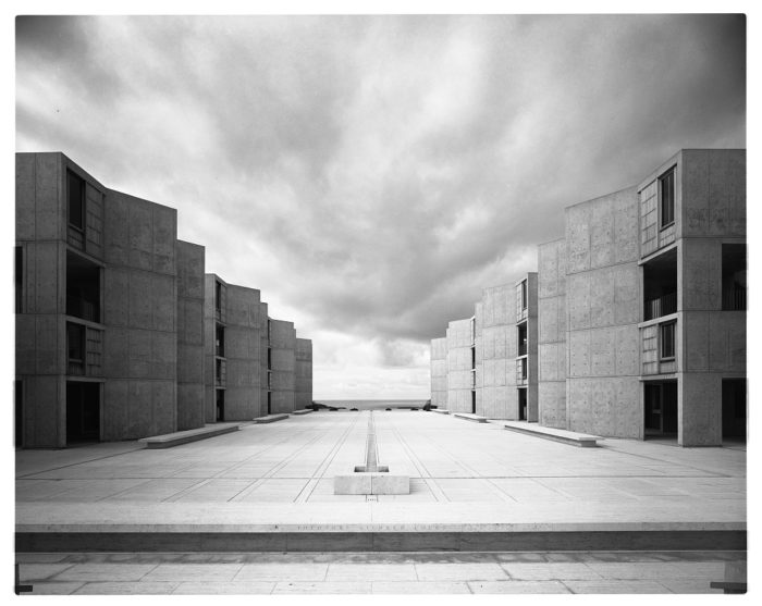
Ornament was for Kahn a matter of artfully articulating the process of a building’s construction and showing the materials employed to best effect, not least when poured-in-place concrete was involved. Erected on a low mesa facing the Pacific, Kahn’s Salk Institute for Biological Studies (1965) in La Jolla, California, with its two ranges of poured-in-place concrete buildings fronting on a travertine-paved courtyard, is the best example of this architectural ethos. Struggling to find a new, enduring home for architecture that bore a significant relation to the architecture of the past, Kahn was a slow, laborious designer who produced fewer than ten noteworthy institutional buildings. His most important work, and his most successfully resolved and therefore most monumental design, is his National Assembly building in Dhaka, Bangladesh, which was completed posthumously.
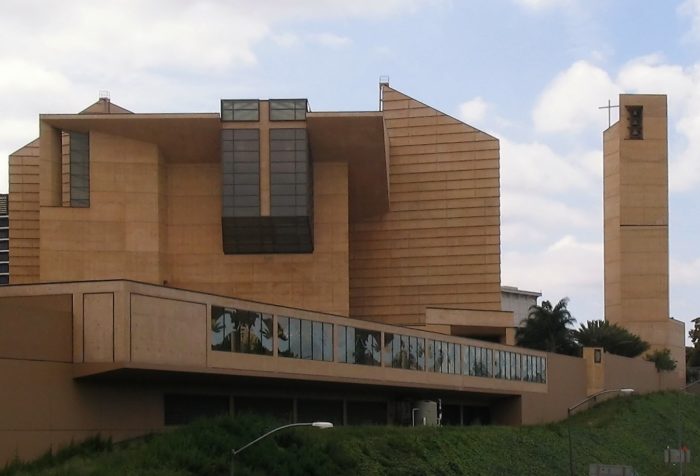
Kahn loved building in brick, and was particularly beholden to the structural drama of brick arches. This passion is most evident in Dhaka and at a campus he designed for a school of management (1974) in Ahmedabad, India. That distinctly Kahnian legacy is evident in one of the most appealing modernist buildings around, the Museum of Roman Art (1986) in Mérida, Spain, designed by José Rafael Moneo. And yet Moneo’s obnoxiously disjointed Cathedral of Our Lady of the Angels (2003) in Los Angeles represents another tiresome exercise in solipsistic expressionism that amounts to a negation of Kahn’s example and Moneo’s own museum. Kahn’s influence on modernist practice has in fact been strikingly limited. His aesthetic principles were most assuredly debatable, but the bottom line is that he was far too serious for the vast majority of today’s modernists.
The unseriousness of today’s architectural culture is telegraphed by a project for a supertall, 100-storey jumble of stacked glass boxes for the Waldorf Astoria Miami, co-designed by the Uruguayan architect of the indemerdable Bastille opera house in Paris that I noted in my previous commentary. This is yet another reminder of modernism’s infinitely generous indulgence of failure in its ongoing quest to induce ever-more-meretricious frissons of incredulity. Small wonder that the ranks of classically oriented designers have been growing for decades now. In the years ahead, we can look for many of them to aspire to the expression of institutional gravitas just as Kahn did, but by relying on precedent established by the great works of the past. Others will seek to take the humanistic tradition in new directions. There will be ample debate about the best path forward. After all, tradition is an embodied debate, as the distinguished philosopher Alasdair MacIntyre has observed.
Catesby Leigh is The American Conservative’s New Urbanism Fellow. He writes about public art and architecture and lives in Washington, D.C.This New Urbanism series is supported by the Richard H. Driehaus Foundation. Follow New Urbs on Twitter for a feed dedicated to TAC’s coverage of cities, urbanism, and place.


